GUI Testing Checklist
A checklist to help testers check GUI
screens
CONTENTS:
1.1. Application
1.2. For Each Window in the
Application
1.3. Text Boxes
1.4. Option (Radio Buttons)
1.5. Check
Boxes
1.6. Command Buttons
1.7. Drop Down List Boxes
1.8. Combo
Boxes
1.9. List Boxes
2.1. Aesthetic Conditions
2.2. Validation
Conditions
2.3. Navigation Conditions
2.4. Usability Conditions
2.5. Data Integrity Conditions
2.6. Modes (Editable Read-only)
Conditions
2.7. General Conditions
2.8. Specific Field Tests
2.8.1. Date Field Checks
2.8.2. Numeric Fields
2.8.3. Alpha Field
Checks
3.1. On every Screen
3.2. Shortcut keys / Hot
Keys
3.3. Control Shortcut Keys
4.1. Document origin
4.2. Sources of Inspiration & information
4.3. Contacting the author.
4.4. Download this file => .pdf 
Section 1 - Windows Compliance
Testing
1.1. ApplicationStart
Application by Double Clicking on its ICON. The Loading message should show the
application name, version number, and a bigger pictorial representation of
the icon (a 'splash' screen).
No Login is necessary
The main window of the application should have the same caption
as the caption of the icon in Program Manager.
Closing the application should result in an "Are you Sure"
message box
Attempt to start application Twice
This should not be
allowed - you should be returned to main Window
Try to start the application twice as it is loading.
On each window, if the application is busy, then the hour glass
should be displayed. If there is no hour glass (e.g. alpha access enquiries)
then some enquiry in progress message should be displayed.
All screens should have a Help button, F1 should work doing the
same.
1.2. For Each Window in the
Application
If Window has a Minimize Button, click it.

Window Should return to an icon on the
bottom of the screen
This icon should correspond to the Original Icon under
Program Manager.
Double Click the Icon to return the Window to its original size.
The window caption for every application should have the name of
the application and the window name - especially the error messages. These
should be checked for spelling, English and clarity , especially on the top
of the screen. Check does the title of the window makes sense.
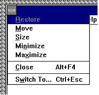
If the screen has an Control menu, then use all ungreyed
options. (see below)

Check all text on window for
Spelling/Tense and Grammar
Use TAB to move focus around the Window. Use SHIFT+TAB to move
focus backwards.
Tab order should be left to right, and Up to Down within a group
box on the screen. All controls
should get focus - indicated by dotted box,
or cursor. Tabbing to an entry field with text in it should highlight the
entire text in the field.
The text in the Micro Help line should change - Check for
spelling, clarity and non-updateable etc.
If a field is disabled (greyed) then it should not get focus. It
should not be possible to select them with either the mouse or by using TAB.
Try this for every greyed control.
Never updateable fields should be displayed with black text on a
grey background with a black label.
All text should be left-justified, followed by a colon tight to
it.
In a field that may or may not be updateable, the label text and
contents changes from black to grey depending on the current status.
List boxes are always white background with black text whether
they are disabled or not. All others are grey.
In general, do not use goto screens, use gosub, i.e. if a button
causes another screen to be displayed, the screen should not hide the first
screen, with the exception of tab in 2.0
When returning return to the first screen cleanly i.e. no other
screens/applications should appear.
In general, double-clicking is not essential. In general,
everything can be done using both the mouse and the keyboard.
All tab buttons should have a distinct letter.
1.3. Text Boxes

Move the Mouse Cursor over all Enterable Text Boxes. Cursor should change
from arrow to Insert Bar.
If it doesn't then the text in the box should be
grey or non-updateable. Refer to previous page.
Enter text into Box
Try to overflow the text by typing to many characters - should
be stopped Check the field width with capitals W.
Enter invalid characters - Letters in amount fields, try strange
characters like + , - * etc. in All fields.
SHIFT and Arrow should Select Characters. Selection should also
be possible with mouse. Double Click should select all text in box.
1.4. Option (Radio Buttons)

Left and Right arrows should move 'ON' Selection. So should Up and Down..
Select with mouse by clicking.
1.5. Check Boxes

Clicking with the mouse on the box, or on the text should SET/UNSET the
box. SPACE should do the same.

1.6. Command Buttons

If Command Button leads to another Screen, and if the user can enter or
change details on the other screen then the Text on the button should be
followed by three dots.
All Buttons except for OK and Cancel should have a letter Access
to them. This is indicated by a letter underlined in the button text. The
button should be activated by pressing ALT+Letter. Make sure there is no
duplication.
Click each button once with the mouse - This should activate
Tab to each button
- Press SPACE - This should activate Tab to each
button
- Press RETURN - This should activate The above are VERY
IMPORTANT, and should be done for EVERY command Button.
Tab to another type of control (not a command button). One
button on the screen should be default (indicated by a thick black border).
Pressing Return in ANY no command button control should activate it.
If there is a Cancel Button on the screen , then pressing
<Esc> should activate it.
If pressing the Command button results in uncorrectable data
e.g. closing an action step, there should be a message phrased positively
with Yes/No answers where Yes results in the completion of the action.
1.7. Drop Down List Boxes

Pressing the Arrow should give list of options. This List may be
scrollable. You should not be able to type text in the box.
Pressing a letter should bring you to the first item in the list
with that start with that letter. Pressing ‘Ctrl - F4’ should open/drop down
the list box.
Spacing should be compatible with the existing windows spacing
(word etc.). Items should be in alphabetical order with the exception of
blank/none which is at the top or the bottom of the list box.
Drop down with the item selected should be display the list with
the selected item on the top.
Make sure only one space appears, shouldn't have a blank line at
the bottom.
1.8. Combo Boxes

Should allow text to be entered. Clicking Arrow should allow user to
choose from list
1.9. List Boxes

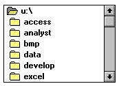
Should allow a single selection to be chosen, by clicking with the mouse,
or using the Up and Down Arrow keys.
Pressing a letter should take you to the first item in the list
starting with that letter.
If there is a 'View' or 'Open' button beside the list box then
double clicking on a line in the List Box, should act in the same way as
selecting and item in the list box, then clicking the command button.
Force the scroll bar to appear, make sure all the data can be
seen in the box.

Section 2 - Screen Validation
Checklist
2.1. Aesthetic Conditions:
- Is the general screen background the correct colour?
- Are the field prompts the correct colour?
- Are the field backgrounds the correct colour?
- In read-only mode, are the field prompts the correct
colour?
- In read-only mode, are the field backgrounds the correct
colour?
- Are all the screen prompts specified in the correct screen
font?
- Is the text in all fields specified in the correct screen
font?
- Are all the field prompts aligned perfectly on the
screen?
- Are all the field edit boxes aligned perfectly on the
screen?
- Are all groupboxes aligned correctly on the screen?
- Should the screen be resizable?
- Should the screen be minimisable?
- Are all the field prompts spelt correctly?
- Are all character or alpha-numeric fields left justified?
This is the default unless otherwise specified.
- Are all numeric fields right justified? This is the default
unless otherwise specified.
- Is all the microhelp text spelt correctly on this
screen?
- Is all the error message text spelt correctly on this
screen?
- Is all user input captured in UPPER case or lower case
consistently?
- Where the database requires a value (other than null) then
this should be defaulted into fields. The
user must either enter an
alternative valid value or leave the default value intact.
- Assure that all windows have a consistent look and
feel.
- Assure that all dialog boxes have a consistent look and
feel.
2.2. Validation Conditions:
- Does a failure of validation on every field cause a sensible
user error message?
- Is the user required to fix entries which have failed
validation tests?
- Have any fields got multiple validation rules and if so are
all rules being applied?
- If the user enters an invalid value and clicks on the OK
button (i.e. does not TAB off the field) is the invalid entry identified and
highlighted correctly with an error message.?
- Is validation consistently applied at screen level unless
specifically required at field level?
- For all numeric fields check whether negative numbers can and
should be able to be entered.
- For all numeric fields check the minimum and maximum values
and also some mid-range values allowable?
- For all character/alphanumeric fields check the field to
ensure that there is a character limit specified and that this limit is
exactly correct for the specified database size?
- Do all mandatory fields require user input?
- If any of the database columns don't allow null values then
the corresponding screen fields must be mandatory. (If any field which
initially was mandatory has become optional then check whether null values are
allowed in this field.)
2.3. Navigation Conditions:
- Can the screen be accessed correctly from the menu?
- Can the screen be accessed correctly from the toolbar?
- Can the screen be accessed correctly by double clicking on a
list control on the previous screen?
- Can all screens accessible via buttons on this screen be
accessed correctly?
- Can all screens accessible by double clicking on a list
control be accessed correctly?
- Is the screen modal. i.e. Is the user prevented from
accessing other functions when this screen is active and is this
correct?
- Can a number of instances of this screen be opened at the
same time and is this correct?
2.4. Usability Conditions:
- Are all the dropdowns on this screen sorted correctly?
Alphabetic sorting is the default unless otherwise specified.
- Is all date entry required in the correct format?
- Have all pushbuttons on the screen been given appropriate
Shortcut keys?
- Do the Shortcut keys work correctly?
- Have the menu options which apply to your screen got fast
keys associated and should they have?
- Does the Tab Order specified on the screen go in sequence
from Top Left to bottom right? This is the default unless otherwise
specified.
- Are all read-only fields avoided in the TAB sequence?
- Are all disabled fields avoided in the TAB sequence?
- Can the cursor be placed in the microhelp text box by
clicking on the text box with the mouse?
- Can the cursor be placed in read-only fields by clicking in
the field with the mouse?
- Is the cursor positioned in the first input field or control
when the screen is opened?
- Is there a default button specified on the screen?
- Does the default button work correctly?
- When an error message occurs does the focus return to the
field in error when the user cancels it?
- When the user Alt+Tab's to another application does this have
any impact on the screen upon return to The application?
- Do all the fields edit boxes indicate the number of
characters they will hold by there length? e.g. a 30 character field should be
a lot longer
2.5. Data Integrity Conditions:
- Is the data saved when the window is closed by double
clicking on the close box?
- Check the maximum field lengths to ensure that there are no
truncated characters?
- Where the database requires a value (other than null) then
this should be defaulted into fields. The user must either enter an
alternative valid value or leave the default value intact.
- Check maximum and minimum field values for numeric
fields?
- If numeric fields accept negative values can these be stored
correctly on the database and does it make sense for the field to accept
negative numbers?
- If a set of radio buttons represent a fixed set of values
such as A, B and C then what happens if a blank value is retrieved from the
database? (In some situations rows can be created on the database by other
functions which are not screen based and thus the required initial values can
be incorrect.)
- If a particular set of data is saved to the database check
that each value gets saved fully to the database. i.e. Beware of truncation
(of strings) and rounding of numeric values.
2.6. Modes (Editable Read-only) Conditions:
- Are the screen and field colours adjusted correctly for
read-only mode?
- Should a read-only mode be provided for this screen?
- Are all fields and controls disabled in read-only
mode?
- Can the screen be accessed from the previous
screen/menu/toolbar in read-only mode?
- Can all screens available from this screen be accessed in
read-only mode?
- Check that no validation is performed in read-only
mode.
2.7. General Conditions:
- Assure the existence of the "Help" menu.
- Assure that the proper commands and options are in each
menu.
- Assure that all buttons on all tool bars have a corresponding
key commands.
- Assure that each menu command has an alternative(hot-key) key
sequence which will invoke it where appropriate.
- In drop down list boxes, ensure that the names are not
abbreviations / cut short
- In drop down list boxes, assure that the list and each entry
in the list can be accessed via appropriate key / hot key combinations.
- Ensure that duplicate hot keys do not exist on each
screen
- Ensure the proper usage of the escape key (which is to undo
any changes that have been made) and generates a caution message "Changes will
be lost - Continue yes/no"
- Assure that the cancel button functions the same as the
escape key.
- Assure that the Cancel button operates as a Close button when
changes have be made that cannot be undone.
- Assure that only command buttons which are used by a
particular window, or in a particular dialog box, are present. - i.e make sure
they don't work on the screen behind the current screen.
- When a command button is used sometimes and not at other
times, assure that it is grayed out when it should not be used.
- Assure that OK and Cancel buttons are grouped separately from
other command buttons.
- Assure that command button names are not
abbreviations.
- Assure that all field labels/names are not technical labels,
but rather are names meaningful to system users.
- Assure that command buttons are all of similar size and
shape, and same font & font size.
- Assure that each command button can be accessed via a hot key
combination.
- Assure that command buttons in the same window/dialog box do
not have duplicate hot keys.
- Assure that each window/dialog box has a clearly marked
default value (command button, or other object) which is invoked when the
Enter key is pressed - and NOT the Cancel or Close button
- Assure that focus is set to an object/button which makes
sense according to the function of the window/dialog box.
- Assure that all option buttons (and radio buttons) names are
not abbreviations.
- Assure that option button names are not technical labels, but
rather are names meaningful to system users.
- If hot keys are used to access option buttons, assure that
duplicate hot keys do not exist in the same window/dialog box.
- Assure that option box names are not abbreviations.
- Assure that option boxes, option buttons, and command buttons
are logically grouped together in clearly demarcated areas "Group Box"
- Assure that the Tab key sequence which traverses the screens
does so in a logical way.
- Assure consistency of mouse actions across windows.
- Assure that the color red is not used to highlight active
objects (many individuals are red-green color blind).
- Assure that the user will have control of the desktop with
respect to general color and highlighting (the application should not dictate
the desktop background characteristics).
- Assure that the screen/window does not have a cluttered
appearance
- Ctrl + F6 opens next tab within tabbed window
- Shift + Ctrl + F6 opens previous tab within tabbed
window
- Tabbing will open next tab within tabbed window if on last
field of current tab
- Tabbing will go onto the 'Continue' button if on last field
of last tab within tabbed window
- Tabbing will go onto the next editable field in the
window
- Banner style & size & display exact same as existing
windows
- If 8 or less options in a list box, display all options on
open of list box - should be no need to scroll
- Errors on continue will cause user to be returned to the tab
and the focus should be on the field causing the error. (i.e the tab is
opened, highlighting the field with the error on it)
- Pressing continue while on the first tab of a tabbed window
(assuming all fields filled correctly) will not open all the tabs.
- On open of tab focus will be on first editable field
- All fonts to be the same
- Alt+F4 will close the tabbed window and return you to main
screen or previous screen (as appropriate), generating "changes will be lost"
message if necessary.
- Microhelp text for every enabled field & button
- Ensure all fields are disabled in read-only mode
- Progress messages on load of tabbed screens
- Return operates continue
- If retrieve on load of tabbed window fails window should not
open
2.8. Specific Field Tests
2.8.1. Date Field Checks
- Assure that leap years are validated correctly & do not
cause errors/miscalculations
- Assure that month code 00 and 13 are validated correctly
& do not cause errors/miscalculations
- Assure that 00 and 13 are reported as errors
- Assure that day values 00 and 32 are validated correctly
& do not cause errors/miscalculations
- Assure that Feb. 28, 29, 30 are validated correctly & do
not cause errors/ miscalculations
- Assure that Feb. 30 is reported as an error
- Assure that century change is validated correctly & does
not cause errors/ miscalculations
- Assure that out of cycle dates are validated correctly &
do not cause errors/miscalculations
2.8.2. Numeric Fields
- Assure that lowest and highest values are handled
correctly
- Assure that invalid values are logged and reported
- Assure that valid values are handles by the correct
procedure
- Assure that numeric fields with a blank in position 1 are
processed or reported as an error
- Assure that fields with a blank in the last position are
processed or reported as an error an error
- Assure that both + and - values are correctly
processed
- Assure that division by zero does not occur
- Include value zero in all calculations
- Include at least one in-range value
- Include maximum and minimum range values
- Include out of range values above the maximum and below the
minimum
- Assure that upper and lower values in ranges are handled
correctly
2.8.3. Alpha Field Checks
- Use blank and non-blank data
- Include lowest and highest values
- Include invalid characters & symbols
- Include valid characters
- Include data items with first position blank
- Include data items with last position blank

Section 3 - Validation Testing - Standard
Actions
3.1. Examples of Standard Actions - Substitute your specific
commands
Add
View
Change
Delete
Continue -
(i.e. continue saving changes or additions)
Add
View
Change
Delete
Cancel - (i.e.
abandon changes or additions)
Fill each field - Valid data
Fill each field -
Invalid data
Different Check Box / Radio Box combinations
Scroll Lists / Drop Down List Boxes
Help
Fill Lists and Scroll
Tab
Tab Sequence
Shift Tab
3.2. Shortcut keys / Hot
Keys
Note: The following keys are used in some windows
applications, and are included as a guide.
| Key |
No Modifier |
Shift |
CTRL |
ALT |
| F1 |
Help |
Enter Help Mode |
n\a |
n\a |
| F2 |
n\a |
n\a |
n\a |
n\a |
| F3 |
n\a |
n\a |
n\a |
n\a |
| F4 |
n\a |
n\a |
Close Document / Child
window. |
Close Application. |
| F5 |
n\a |
n\a |
n\a |
n\a |
| F6 |
n\a |
n\a |
n\a |
n\a |
| F7 |
n\a |
n\a |
n\a |
n\a |
| F8 |
Toggle extend mode, if
supported. |
Toggle Add mode, if
supported. |
n\a |
n\a |
| F9 |
n\a |
n\a |
n\a |
n\a |
| F10 |
Toggle menu bar
activation. |
n\a |
n\a |
n\a |
| F11,
F12 |
n\a |
n\a |
n\a |
n\a |
| Tab |
Move to next active/editable
field. |
Move to previous active/editable
field. |
Move to next open Document or Child
window. (Adding SHIFT reverses the order of movement). |
Switch to previously used
application. (Holding down the ALT key displays all open
applications). |
|
Alt |
Puts focus on first menu command
(e.g. 'File'). |
n\a |
n\a |
n\a | 
3.3. Control Shortcut Keys
| Key |
Function |
| CTRL + Z |
Undo |
| CTRL + X |
Cut |
| CTRL + C |
Copy |
| CTRL + V |
Paste |
| CTRL + N |
New |
| CTRL + O |
Open |
| CTRL + P |
Print |
| CTRL + S |
Save |
| CTRL + B |
Bold* |
| CTRL + I |
Italic* |
| CTRL + U |
Underline* | * These shortcuts are suggested for text formatting applications, in the
context for which they make sense. Applications may use other modifiers for
these operations.
Download this file => .pdf 
4. Origin & Inspiration
I first conceived this checklist for training testers who were going to
be working on a new PowerBuilder
application (on a Windows for Workgroups
platform) to be used in the initial screen validation testing phase.
The initial input for the list came from a site I found on the
web, the remainder of the checklist I made up from internal & external
design standards, and experience gained over the last few years working in QA.
A long time ago I replied to a query (on comp.software.testing)
regarding gui/client-server testing and when I mentioned this checklist I
got quite a few requests for copies, and as a result I decided to publish it on
the web.
thanks, and good luck.
Bazman

|


 GUI Test Checklist